I am having trouble aligning text boxes with other features in a step. I center the text in the step. It looks ok when I look at it in the viewer, but when I publish it, its position doesn’t match. The text is also much smaller when published. I have tried configuring the PC screen size with no improvement. Where is the position of a text box measured from, the center or a corner.
All 2D items are measured from the top left corner. Can you share a link to your published project so we can take a look?
You can send it via private message here on the forum , or via our contact page
If you haven’t seen it already may I suggest watching the following video which also discussed sizing and positions.
This is the link
I used the align tool to center all the text.
I also noticed that the font appeared larger and centered when I made a movie.
Could you tell me which step to look at, and ideally send a screenshot of what you are seeing to make sure we are looking at the same thing? Thanks
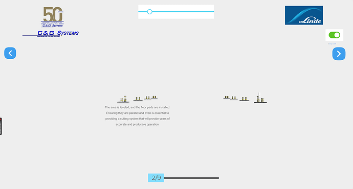
This is one of the steps showing the text is smaller. I think this is the reason I thought the text was not centerer. If the text font was correct, (it is set to small) it should appear centered.
Sorry for the delayed response. I have looked at your project, both in the designer and in the viewer and cannot see any difference between the two. How it shows in the viewer looks as it should as far as I can see.
When saving a movie, if you have the option for it to be full screen, then I would expect there to be a subtle difference, as technically the screen aspect ratio has changed (e.g. the browser’s address bar, tabs and any additional toolbars you have will have gone). If you go full screen in the designer (press F11 in Chrome) does it match?
